
Responsive Design क्या है?
Responsive Web Design का मतलब है कि वेबसाइट का layout अलग-अलग screen sizes (जैसे Desktop, Tablet, Mobile) पर अपने आप सही तरीके से adjust हो जाए।
उदाहरण:
- Desktop पर वेबसाइट बड़ी दिखाई देगी।
- Tablet पर layout थोड़ा छोटा हो जाएगा।
- Mobile पर content एक column में आ जाएगा।
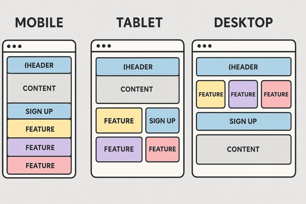
Responsive Design की आवश्यकता क्यों है?
आज लोग वेबसाइट को अलग-अलग devices पर खोलते हैं:
- Computer/Laptop
- Tablet
- Smartphone
- Smart TV
अगर वेबसाइट responsive नहीं होगी तो:
- Text छोटा या बड़ा दिख सकता है।
- Images कट सकती हैं।
- Horizontal scrolling करनी पड़ सकती है।
CSS Responsive Design के मुख्य Concepts
1. Flexible Layout
Fixed width की जगह flexible units का उपयोग किया जाता है।
Fixed Width:
.box {
    width: 500px;
}
यह हर screen पर 500px ही रहेगा।
Responsive Width:
.box {
    width: 50%;
}
यह parent element के अनुसार बदल जाएगा।
2. Responsive Units का उपयोग
Responsive design में इन units का ज्यादा उपयोग होता है:
| Unit | उपयोग |
|---|---|
| % | Parent के अनुसार size |
| em | Parent font-size के अनुसार |
| rem | Root font-size के अनुसार |
| vw | Viewport width के अनुसार |
| vh | Viewport height के अनुसार |
Example:
.container {
    width: 80vw;
}
3. Media Query (सबसे महत्वपूर्ण)
Media Query का उपयोग अलग-अलग screen size के लिए अलग CSS लिखने के लिए किया जाता है।
Syntax:
@media screen and (condition) {

    CSS Code

}
Example:
.container {
    width: 80%;
}


/* Mobile */
@media screen and (max-width: 600px) {

    .container {
        width: 100%;
    }

}
मतलब:
अगर screen width 600px या उससे कम है तो container की width 100% हो जाएगी।
Common Breakpoints
| Device | Width |
|---|---|
| Mobile | 320px – 600px |
| Tablet | 601px – 900px |
| Laptop | 901px – 1200px |
| Desktop | 1200px+ |
4. Responsive Images
Image को responsive बनाने के लिए किया जाता है:
img {
    max-width: 100%;
    height: auto;
}
इससे image अपने container से बाहर नहीं जाएगी।
5. CSS Flexbox का उपयोग
Flexbox responsive layouts बनाने में बहुत उपयोगी है।
Example:
.container {
    display: flex;
    flex-wrap: wrap;
}
flex-wrap items को नई line में जाने देता है।
6. CSS Grid Responsive Design
Grid में responsive columns बना सकते हैं।
Example:
.container {

    display: grid;

    grid-template-columns: repeat(
        auto-fit,
        minmax(200px, 1fr)
    );

}
यह screen size के अनुसार columns की संख्या बदल देगा।
7. Mobile First Design
इस approach में पहले mobile के लिए CSS लिखते हैं, फिर बड़े screens के लिए changes करते हैं।
Example:
.card {

    width: 100%;

}


@media(min-width:768px){

.card{

    width:50%;

}

}
8. Viewport Meta Tag
Responsive website के लिए HTML में यह tag जरूरी है:
<meta name="viewport" content="width=device-width, initial-scale=1.0">यह browser को बताता है कि page device की width के अनुसार scale हो।
Responsive Design के Important Properties
| Property | उपयोग |
|---|---|
| max-width | Maximum width control |
| min-width | Minimum width control |
| width | Element size |
| flex-wrap | Items को wrap करना |
| grid-template-columns | Grid layout |
| @media | Screen size के अनुसार CSS |
| max-width:100% | Responsive images |
इन्हे भी पढ़े :
- CSS Full course Roadmap 2026CSS Introduction↓CSS Syntax & Basic Concepts↓Selectors↓CSS Properties↓Colors & Backgrounds↓Text & Fonts↓Box Model↓Display & Positioning↓Flexbox↓CSS Grid↓Responsive Design↓Animations & Transitions↓Advanced CSS↓CSS Frameworks↓Real Projects↓Professional Frontend Developer
- What is CSS in Hindi ? How to learn for CSS in HindiTypes of CSS in Hindi 1. Inline CSS Inline CSS का use HTML tags के अंदर ही किया जाता है| लेकिन इसे Style Attribute के द्वारा use किया जाता है | Syntax : Example : 2. Internal CSS Internal CSS को लिखने के लिए हमें style टैग को create करना पड़ता है, क्योंकि बिना style… Read more: What is CSS in Hindi ? How to learn for CSS in Hindi
- CSS Syntax & Basic Concepts in Hindi (basic to advanced)CSS Syntax : Basic Syntax : Example : Explained : Parts Meaning h1 Selector (जिस element को style करना है) color Property (क्या बदलना है) blue Value (किस प्रकार बदलना है) { } CSS Declaration Block ; प्रत्येक property के बाद लगाया जाता है CSS Syntax के मुख्य भाग 1. Selector Selector यह बताता है… Read more: CSS Syntax & Basic Concepts in Hindi (basic to advanced)
- CSS Properties in Hindi (Professional website build)CSS Property वह नियम (rule) होता है जिसके द्वारा हम HTML elements की design, style और appearance को बदलते हैं। Syntax : CSS Properties के मुख्य प्रकार 1. Color Properties 1. color Color Properties का उपयोग Text का रंग बदलने के लिए किया जाता है। Syntax : 2. background-color Background-color का उपयोग Element का background… Read more: CSS Properties in Hindi (Professional website build)
- CSS display & positioning in Hindi (Beginner to Advanced)CSS में Display और Positioning का उपयोग HTML elements को webpage पर दिखाने और उनकी जगह (location) को नियंत्रित करने के लिए किया जाता है। 1. CSS Display Property display property यह बताती है कि कोई HTML element webpage पर किस प्रकार दिखाई देगा। Syntax: Display Property के मुख्य Types : Display Value Meaning (अर्थ)… Read more: CSS display & positioning in Hindi (Beginner to Advanced)